This Story
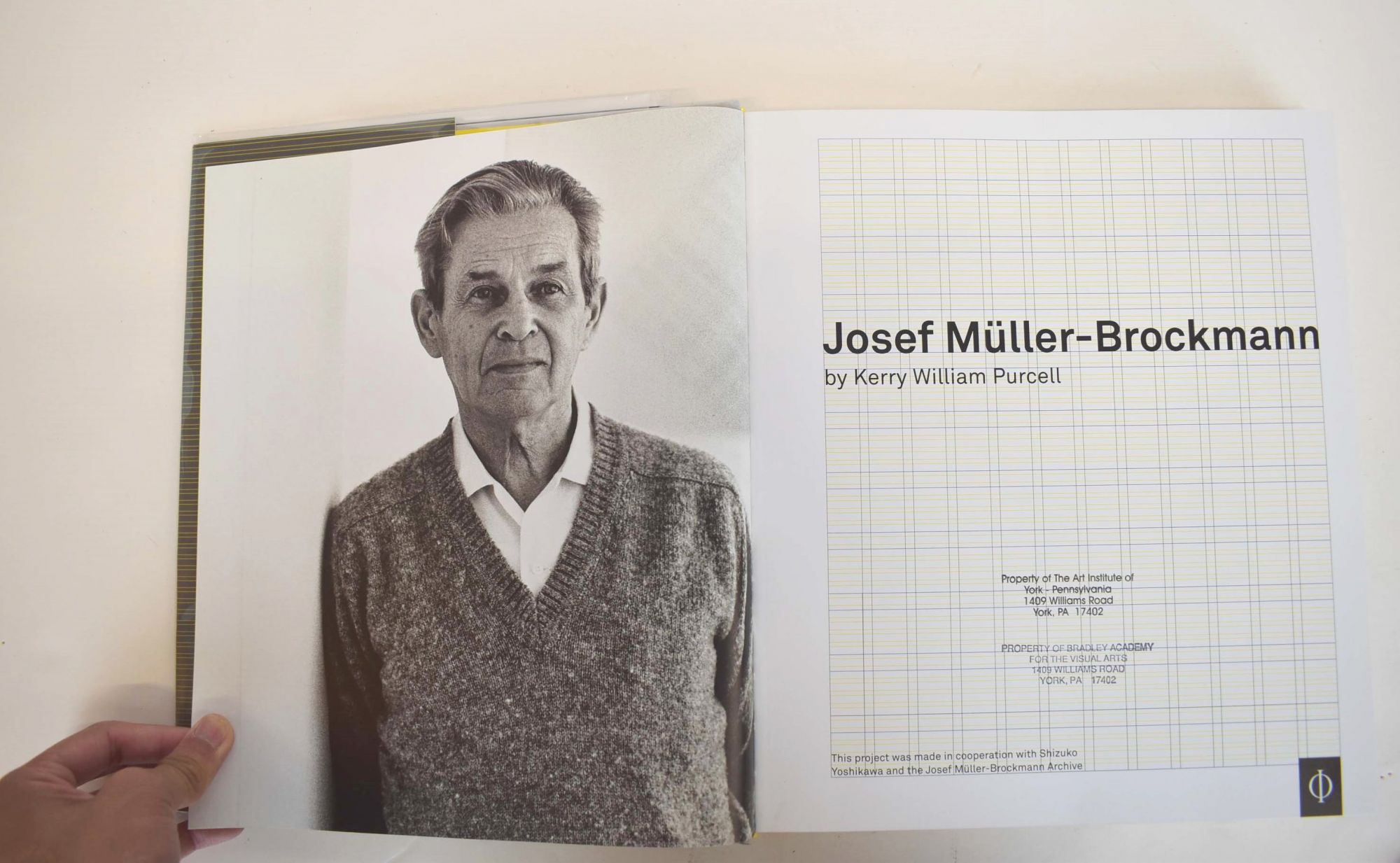
Josef Müller Brockmann
Josef Müller Brockmann was born in Rapperswil, Switzerland in 1914 and studied architecture, design and history of art at the University of Zurich and at the city’s Kunstgewerbeschule. He began his career as an apprentice to the designer and advertising consultant Walter Diggelman before, in 1936, establishing his own Zurich studio specialising in graphics, exhibition design and photography. According to his own account;
"I became a graphic designer by accident". At school I was loth to write much for compositions so I put in illustrations instead. My teacher enjoyed them and thought I had talent. He suggested that I should pursue an artistic career: gravure etching or retouching, for instance. So I was apprenticed as a retoucher in a printing works. I lasted one day because I said that this wasn’t artistic work. After that I was apprenticed to two elderly architects. With them I lasted four weeks. Then I went to see all the graphic designers I found listed in the telephone directory because I wanted to find out what they did. Afterwards I enrolled to study graphic design at the Zurich Gewerbeschule."
Skills and Style
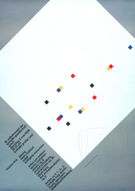
As a graphic designer, Müller Brockmann's skills included letterpress, silkscreen, and lithography. His geometric style was demonstrated in “Musica viva”, a series of concert posters for the Zurich Tonhalle in 1951. It is arguably claimed that his work was an adaptation of concrete art; which had been described by Theo van Doesburg around 1930, as works of art that are created by means of art's most genuine means of composition and principles, entirely doing without allusions to phenomenon of nature and their abstraction. New realities were supposed to be created by forming colors, space, light and movement.
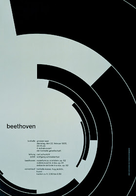
The style had to incorporate mathematical methods of spatial organization into graphic work, which drew on the language of Constructivism to create a visual correlative to the structural harmonies of the music. Müller Brockmann's 1955 poster, Beethoven, was supposed to portray Beethoven's music through a series of concentric curves, and has been offered as an example such an adaptation, and this assertion had been accepted at its face value by many pundits, who were impressed by the novelty, elegance and the simplicity of design. As Müller Brockmann has stated:
"In my designs for posters, advertisements, brochures and exhibitions, subjectivity is suppressed in favour of a geometric grid that determines the arrangement of the type and images. The grid is an organisational system that makes it easier to read the message...The grid is an organisational system that enables you to achieve an orderly result at a minimum cost. The task is solved more easily, faster and better. It brings the arbitrary organisation of text into a logical system in keeping with the conflict. It can demonstrate uniformity that reaches beyond national boundaries, a boon to advertising from which IBM, for instance, has profited. Objective-rational design means legible design, objective information that is communicated without superlatives or emotional subjectivity."
Brockman's Professional Roles
From 1967 he was European design consultant for IBM. He is the author of The Graphic Artist and his Design Problems (1961), History of Visual Communication (1971), History of the Poster (with Shizuko Muller-Yoshikawa, 1971). Nevertheless, Müller Brockmann's work was rigid and soulless, suffering from certain self-imposed restrictions of the Swiss style, and dogmas such as the rejection of symmetry since fascists had liked it! He has said:
"symmetry and the central axis are what characterise fascist architecture. Modernism and democracy reject the axis... I have taken my love of order to the point of manifest boredom, producing design solutions which are valid but deadly boring. Thanks to the passage of time, I am now just about able to examine my posters for the Zurich Tonhalle to discover why some are better than others. I am amazed how many are bad. The Beethoven poster is good, also the “Musica Viva” poster of 1970 with the green lettering on a blue background and the two Tonhalle posters of 1969 and 1972 with the rhythmic type."
Looking at this juncture at these posters, when digital software packages can do any of them in just few minutes and with couple of clicks, it is easy to dismiss the whole exercise as boring and insignificant. Of course, the world would have become a boring place should all posters have adopted the Swiss grid style. However, we have to remind ourselves that when these posters appeared on the scene their geometrical aesthetics were quite novel and rare. Perhaps ironically, Müller Brockmann has stated that he did not like experiments such as that of Neville Brody's typefaces that have the potential to rescue the grid style.
*Note: This story was adapted from Guity-Novin.